Introduction:

In this post, we’ll walk you through creating an impressive overlapping page animation effect in Webflow. With easy-to-follow instructions and accompanying visuals, you’ll learn how to elevate your website’s visual appeal and engage your audience with seamless transitions between sections. Adding an overlapping page animation effect can enhance your website’s visual appeal and create a memorable user experience.
Table of Contents
Step 1: Access the Webflow Dashboard

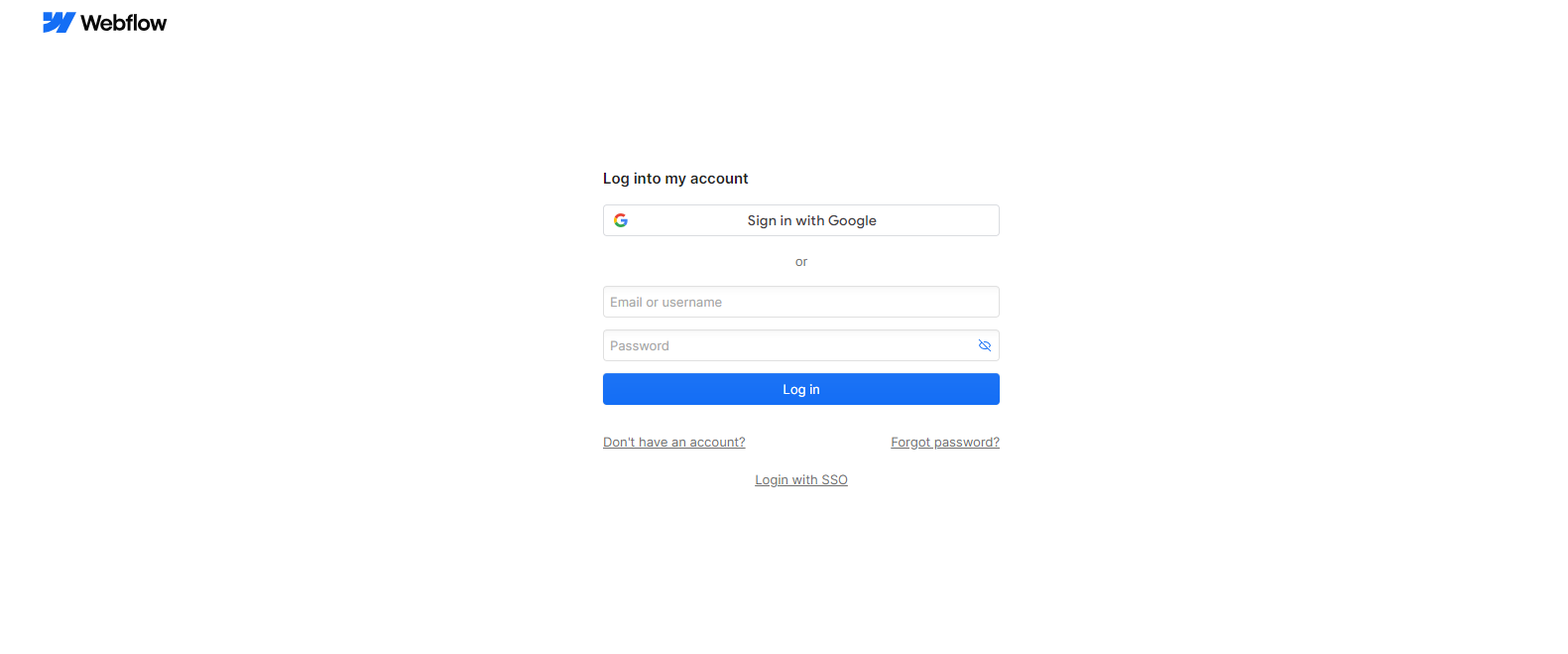
– Log in to your Webflow account and access the Webflow dashboard.
Step 2: Select Your Project
– Choose the project where you want to add the overlapping page animation effect.
Step 3: Navigate to the Designer
– Click the “Designer” button to enter the Webflow Designer interface for your selected project.
Step 4: Create Sections for Overlapping Effect
– Within the Designer, create sections for each website page where you want the overlapping effect to occur.
Step 5: Adjust Z-Index and Positioning
– Select each section and adjust the positioning properties. Increase the z-index value for sections that should overlap others.
Step 6: Apply Animation
– Click the “Interactions” tab and select “Scroll Trigger” to create a new animation.
– Choose the trigger point and animation type (e.g., fade in, slide in).
– Apply the animation to the overlapping sections to create the desired effect.
Step 7: Preview and Publish
– Preview your website to see the overlapping page animation effect in action.
– Once satisfied, publish your changes to make the effect live on your website.
Tips for Creating Overlapping Page Animation Effect in Webflow
Here are some additional tips for creating an Overlapping Page animation effect in Webflow:
- Experiment with varying background colors for each section to enhance visual appeal.
- Play around with different sizes and shapes of sections to add dynamism to your design.
- Apply diverse scroll animations to individual sections for a more interactive user experience.
Conclusion:
Following these 7 simple steps, you can easily create an impressive overlapping page animation effect in Webflow. This will enhance the visual appeal of your website and capture your audience. Experiment with different animation styles and trigger points to achieve the desired effect that aligns with your website’s design and brand identity.
Frequently Asked Questions
What is the overlapping page animation effect in Webflow?
The overlapping page animation effect in Webflow is a dynamic and visually appealing design technique that involves animating page elements to transition smoothly between sections. It creates a seamless flow as users scroll down the webpage, with elements overlapping and transitioning in a captivating manner.
How can I implement the overlapping page animation effect in Webflow?
Implementing the overlapping page animation effect in Webflow involves utilizing Webflow’s powerful animation tools, such as interactions and scroll-based triggers. You can design custom animations for each element, specifying their movements, timings, and transitions to achieve the desired effect. By carefully orchestrating these animations, you can create a captivating user experience that enhances engagement and interactivity.
What are some key considerations when creating overlapping page animations in Webflow?
When creating overlapping page animations in Webflow, it’s essential to consider factors such as timing, easing functions, and the overall user experience. Ensure that animations are smooth and responsive across different devices and screen sizes. Additionally, pay attention to performance optimization to prevent any lag or slowdowns, especially on mobile devices. Striking a balance between creativity and functionality is crucial for delivering an engaging user experience.
Can I customize the overlapping page animation effect to match my website’s design aesthetic?
Yes, one of the advantages of using Webflow is the ability to customize your website’s design and animation fully. You can tailor the overlapping page animation effect to align with your website’s branding, color scheme, and overall design aesthetic. Experiment with different animation styles, transitions, and effects to create a unique and visually stunning experience that resonates with your audience.


