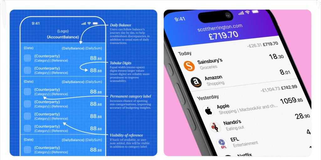
When we think about mobile banking or internet banking interfaces, one of the most frequently accessed — yet least-loved — screens is the transaction list view. It’s the place where users can quickly check if their salary has arrived, if a payment was successfully sent, or where their recent spending has been recorded. how to redesign your transaction list view with user-friendly UX strategies that simplify, clarify, and enhance the mobile banking experience.

But despite its daily utility, the design of this list is often a chaotic mess: information overload, redundant fields, cryptic terminology, and clunky interactions. So, how can we make a transaction list more lovable? Looking to improve your app’s user experience? Try Lovable now and discover how small design changes can make a big difference. It’s fast, effective, and built for modern teams.
In this post, we’ll explore a user-centered redesign approach to improve the usability and emotional connection of this critical banking interface. We’ll look at common pitfalls, what real users need, and how smart UX decisions can elevate the experience, all backed by interviews, UI tools, and usability testing.
Table of Contents
The Problem with the Traditional Transaction View
Whether you’re using desktop internet banking or a mobile app, you’ve likely encountered the same layout: an endless chronological list of transactions, densely packed with text, confusing icons, and financial jargon.

This might seem like a straightforward UI problem, but in reality, it’s far from simple. Design with confidence and clarity. Join Lovable today and start turning cluttered screens into seamless, user-friendly experiences your audience will appreciate.
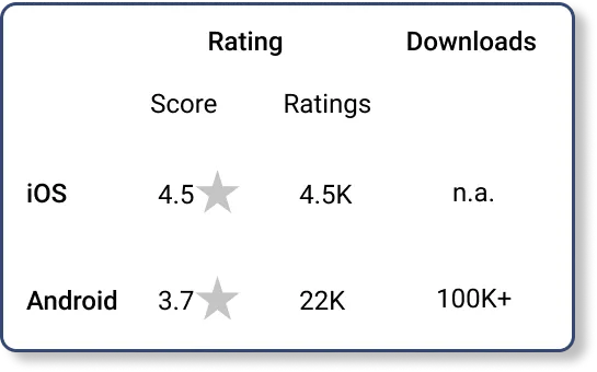
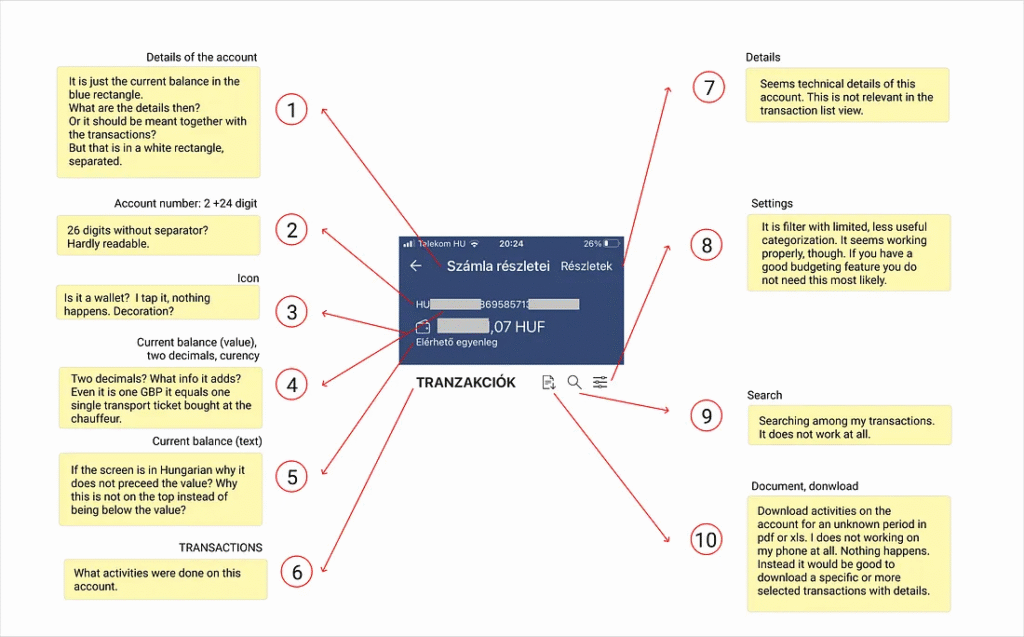
Let’s analyze an actual example: a mobile banking app widely used in Hungary, evaluated on an iPhone SE. The app itself has won awards and is targeting an affluent iOS user base. Yet the transaction view, like many others, suffers from legacy design and usability shortcomings.

Here’s what we found:
Cluttered Layout
On a 4-inch screen, each transaction is presented with up to 20 different pieces of visual and textual information, 10 of which are repeated for every item. That’s an overwhelming amount of data for a user trying to find one simple thing: did this transaction go through?
Redundant Information
The balance is displayed prominently on this screen, even though it’s already shown on the home screen. This adds unnecessary noise to the interface when users are only interested in recent activity.
Confusing Terminology
Banking jargon appears throughout the list, with terms users don’t understand. The direction of transactions (debit or credit) isn’t immediately clear unless you inspect the column layout carefully.
Poor Filtering/Search Functions
In user interviews, none of the users utilized the app’s search or filter features. Why? Because:
- They don’t trust it to work properly
- It adds too many interaction steps
- Scrolling is faster and more intuitive
Interested in seeing Lovable in action? Check out our step-by-step guide on how we Built an AI Coach Website with Lovable. It’s a perfect example of how intuitive design and smart UX choices can bring even the most complex ideas to life.
User Research: What Do People Do?
We approached this redesign project from the perspective of real users — not bankers, not designers, just everyday people.
Through short interviews and usability testing with three participants, we discovered their behaviors and expectations:
- Quick Checkers: Most users scroll through the list to quickly confirm if a transaction was successful.
- Budget Trackers: One user used it to identify spending patterns but preferred a third-party budgeting app instead.
- Minimal Interaction: All users avoided complex features like advanced filters or keyword search unless necessary.
The key takeaway: users want simplicity, clarity, and speed. They aren’t looking for a deep database query tool. They just want to recognize familiar transactions fast and move on. Want to build interfaces users enjoy? Sign up for Lovable and access smart UX tools that make design easier and more intuitive than ever.
The UX Diagnosis: What Needs to Change
After analyzing the layout and collecting user feedback, we identified the following areas for improvement:

1. Too Much Cognitive Load
Each transaction includes extra data that’s only relevant to the bank’s internal systems (e.g., transaction codes, backend identifiers). These details offer no value to the user and only create clutter.
2. Redundant Visuals
Repeated icons, layout elements, and even horizontal separators all contribute to visual noise. With better hierarchy and spacing, we can simplify the layout while improving readability.
3. Poor Use of Color and Contrast
The original color palette (blue, gray, and orange) is inconsistent and lacks clarity. There’s also a missed opportunity to visually differentiate credit and debit transactions, which could significantly help users.
The Redesign: A 4-Step Strategy to a More Lovable View
Armed with these insights, we developed a 4-step redesign approach using Figma and Placeit for mockups and WebAIM to ensure accessibility and proper contrast ratios.
Step 1: Clean the Top Section
The upper third of the screen originally showed:
- Account balance
- Title in uppercase
- Download option
- Filter
- Search (often broken)
Redesign Action:
- Remove the account balance — already visible on the home screen
- Change the title to title case (e.g., “Transaction History”) for softer readability
- Keep only Search and Download functions
- Integrate filter options within the search interface, reducing interaction steps
The new header is minimal, functional, and more visually relaxing. Take your product from functional to lovable. Get started with Lovable and explore features that simplify your UI and delight your users from the first tap.
Step 2: Simplify Each Transaction Row
Each transaction now focuses only on what matters:
- Date
- Type of transaction (in plain language)
- Amount with currency
- Recipient or Sender name
- Optional identifier (if useful to the user)
All irrelevant backend information was removed. Jargon was replaced with user-friendly wording. For example:
- “Direct debit authorization” becomes “Monthly utility bill”
- “Outgoing SEPA Transfer” becomes “Money sent”
This change dramatically reduces cognitive load and aligns the UI with real-world language.
Step 3: Enhance Visual Hierarchy and Contrast
The original used a light gray font (#7C7C7C) for secondary text and a horizontal line between transactions. We changed:
- Font color to #767676 — better contrast while still secondary
- Removed horizontal separators (not needed with simplified layout)
- Added visual cues for transaction direction:
- Green for incoming (+)
- Red for outgoing (−)
- Green for incoming (+)
Surprisingly, a tester pointed out that a feed full of minus signs felt “sad,” so we incorporated a few positive transactions (e.g., salary or refund) in the default state to balance emotional tone. Looking to personalize your AI experience? Don’t miss our guide on how to Add Custom Knowledge to Your Project 2025 — a simple way to tailor your project’s intelligence to match your exact needs.
Step 4: Validate and Iterate
After applying the redesign, we tested the final version with the same users. Reactions included:
- “It feels much less stressful now.”
- “I know what each item means.”
- “I like that I can find what I need faster.”
Even minor changes — like switching from all caps to sentence case — were noticed and appreciated. Visual clarity and reduced friction led to a more emotionally pleasing experience.
Transform Complex Interfaces into Seamless User Experiences
At Axiabits, we specialize in elevating user experiences through intuitive design, UX audits, and custom development solutions. Whether you’re building a fintech product or redesigning a legacy system, we can help turn cluttered UIs into clean, user-friendly experiences.
Book now and let’s get started!
Final Thoughts: Design with Empathy
The goal of this redesign wasn’t to revolutionize banking UIs but to prove that even small, thoughtful improvements can significantly enhance the user experience.
The transaction list view is one of the most used — and most overlooked — screens in financial apps. By reducing complexity, using plain language, improving contrast, and designing with emotional impact in mind, we can make this screen not just usable, but lovable.
Ultimately, a lovable product understands its users. Want to make your interfaces more user-friendly and enjoyable? Sign up for Lovable and start designing experiences your users will love. It’s quick, intuitive, and made for creators like you — join now and try it out!
Disclaimer
This article features affiliate links, which indicate that if you click on any of the links and make a purchase, we may receive a small commission. There’s no extra cost to you, and it aids in supporting our blog, enabling us to keep delivering valuable content. We solely endorse products or services that we think will benefit our audience.
Frequently Asked Questions
Why is the transaction list view important in a banking app?
It’s the most frequently used screen where users check their financial activity. A poorly designed view leads to frustration and potential errors.
What are the biggest UX mistakes in transaction views?
Information overload, poor labeling, unnecessary repetition, and lack of clear visual hierarchy.
How do users interact with this view?
Most users scroll quickly to verify recent transactions. Search and filters are rarely used unless they are highly intuitive and functional.
Can these design principles be applied to other apps?
Absolutely. These principles — simplicity, clarity, empathy — are foundational to any user-centered design, especially in data-dense apps.


